
A Data Scientist's Journey into the Realm of Love!💘
Unraveling the Secrets of Speed Dating: A Data Scientist’s Journey into the Realm of Love! 💘
As a single data scientist, I couldn’t resist the allure of putting the power of data science into the world of love and romance. Join me as I embark on a whimsical and enlightening analysis of speed dating data, revealing the quirky patterns and fascinating statistics that govern our hearts.
The speed dating dataset
The dataset speed dating data is quite substantial — over 8,000 observations with almost 200 datapoints for each. In 2002–2004, Columbia University ran a speed-dating experiment where they tracked 21 speed dating sessions for mostly young adults meeting people of the opposite sex. I found the dataset and the key to the data here: dataset.
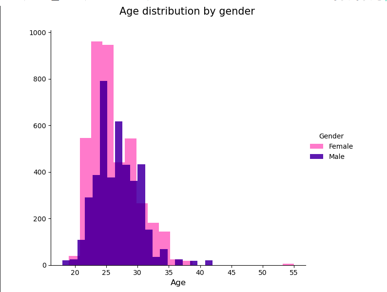
Age Distribution: Is Love a Matter of Timing?
Let’s begin with age, the timeless factor in the dating universe. After analyzing the data, it turns out that most of the participants in the speed dating experiment were in their mid-twenties to early thirties. Ah, the prime time for romantic adventures! So folks, if you’re feeling that the clock is ticking, worry not! You’re right on track with the dating universe’s age standards.

Gender Dynamics: A Dance of Romantic Timing
But wait, the gender differences add a delightful twist to the tale. While ladies dominated the scene in their twenties, the gents had their moment in the early thirties. A dance of romantic timing, wouldn’t you say?
# Define custom labels for the legend
gender_labels = ['Female', 'Male']

# Define custom colors for the legend
gender_colors = {'Female': 'hotpink', 'Male': 'darkblue'}

# Create the FacetGrid
g = sns.FacetGrid(data, hue='gender', height=6, palette=[gender_colors[label] for label in gender_labels])

# Plot the histogram
g.map(plt.hist, 'age', alpha=0.7, bins=20)

# Set x-axis label
g.set_xlabels('Age', fontsize=12)

# Set title for the entire plot
plt.subplots_adjust(top=0.9)
g.fig.suptitle('Age distribution by gender', fontsize=15)

# Add custom legend with labels and colors
legend = g.add_legend(title='Gender', labels=gender_labels)


# Show the plot
plt.show()
The Quest for Love: Matchmaking Success Rate
Now, let’s dive into the matchmaking success rate. Brace yourselves for this one! The majority of speed dating interactions didn’t lead to a match. But hey, don’t be disheartened! Love might be elusive, but it’s not impossible. As they say, it’s not about the number of tries; it’s about the magical moment when two hearts connect.
#before we start let's see how many of the participant found their match❤️🔥
matches_count = data['match'].value_counts()
print("Frequency of Matches:")
print(matches_count)
# Plot the histogram
plt.figure(figsize=(8, 6))
plt.bar(matches_count.index, matches_count.values, color=['red', 'green'])
plt.xlabel('Match')
plt.ylabel('Count')
plt.title('Histogram of Match Counts (Yes and No)')
plt.xticks([0, 1], ['No', 'Yes'])
plt.show()
These initial statistics show that the majority of speed dating interactions did not lead to a match, while a smaller percentage of interactions did result in a successful match. This indicates that the success rate of finding a match was relatively low during the speed dating events(well 4 minutes seems not enough to like someone !!). so there is NO love at first sight!!!!😱
Gender differences in finding their Matches
Do women receive more positive final decisions from the other person (dec_o) than men do?
# Set color palette for pink and blue
colors = {'Female': 'hotpink', 'Male': 'darkblue'}

# Create an interactive histogram with pink and blue colors
fig = px.histogram(data, x='dec_o', color='gender', color_discrete_map=colors, barmode='group')

# Update the layout of the histogram
fig.update_layout(
    title='Decision of Opposite Gender by Gender',
    xaxis_title='Decision (1: Yes, 0: No)',
    yaxis_title='Count',
    showlegend=True,  # Show the custom legend with pink and blue colors
    legend_title='Gender',  # Set the title for the legend
)

# Show the interactive histogram
fig.show()
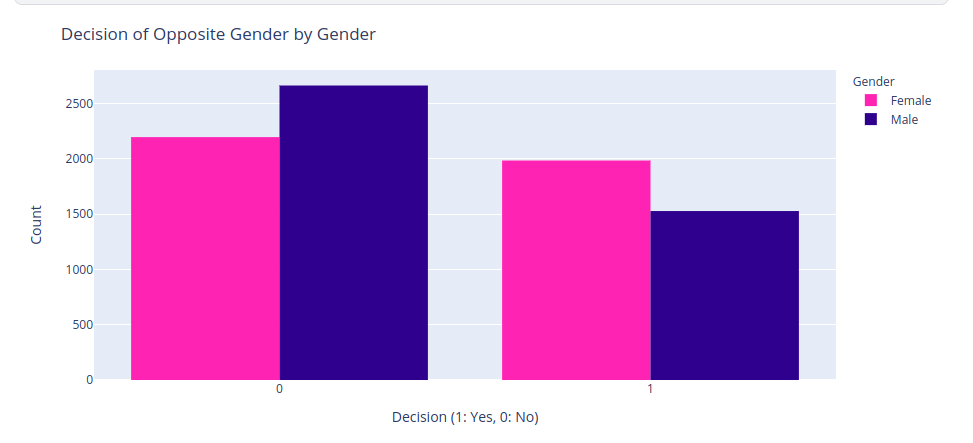
It looks like women received about 2189 no and about 1986 yes for the decision question “Would you like to see him or her again?”. Men received about 2665 no and about 1529 yes. In other words, men are more likely to be rejected by women than women are to be rejected by men. This is a statistically significant difference as confirmed by the above chi-squared test p-value. Poor guys!🙈
Heartbreak in the Air: Unrequited Love
Speaking of gender dynamics, it seems like men had a tougher time winning hearts. The fairer sex, our charming ladies, were more likely to receive positive decisions from their dates. Go ladies! But fret not, gentlemen. Love’s path is never smooth, but it’s worth every pursuit. So how many interactions were unrequited love? That is, getting the count of rows where dec_o = 1 AND dec = 0 OR a dec = 1 AND dec_o = 0?
# unrequited love count
no_love_count = len(data[(data['dec_o']==0) & (data['dec']==1)])
+ len(data[(data['dec_o']==1) & (data['dec']==0)])
perc_broken_heart = no_love_count / len(data.index)
perc_broken_heart*100
So it seems 26% of participants, unfortunately, had their heart broken. More than the percentage of people who got a second date!
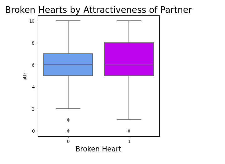
Out of curiosity Does attractiveness can save you from a broken heart in the speed dating world!!!
# looking at url by attractiveness
plt.figure(figsize=(7,9))
sns.boxplot(x='url', y='attr', data=data, palette='cool')
plt.title('Broken Hearts by Attractiveness of Partner', fontsize=20)
plt.xlabel('Broken Heart', fontsize=16)
import statsmodels.api as sm
# chi-square test
bh_crosstab = pd.crosstab(index=data.attr, columns=data.url)
bh_table = sm.stats.Table(bh_crosstab)
bh_rslt = bh_table.test_nominal_association()
bh_rslt.pvalue
>> 0.12624323316870334
Looks like the difference in attractiveness was not statistically significant. So the good news is, the likelihood of getting rejected is not dependent on your attractiveness!☘️
Correlation between attributes
date5 = pd.concat([data['attr3_1'], data['sinc3_1'], data['intel3_1'], data['fun3_1'], data['attr_o'],
                   data['sinc_o'], data['intel_o'], data['fun_o'], data['like'], data['like_o'],
                   data['int_corr'], data['url']], axis=1)

plt.subplots(figsize=(15, 10))
ax = plt.axes()
ax.set_title("Correlation Heatmap")
corr = date5.corr()
sns.heatmap(corr,
            xticklabels=corr.columns.values,
            yticklabels=corr.columns.values)
plt.show()
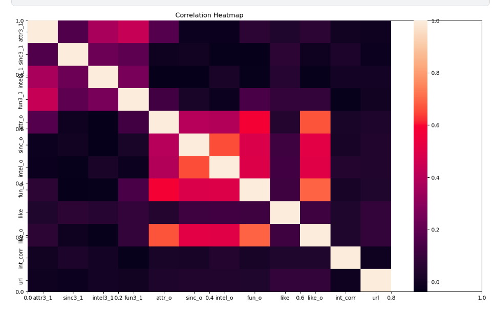
Well, well, well! No matter how drop-dead gorgeous or incredibly charming you think you are, heartbreak might just be lurking around the corner, ready to pounce on anyone!
Oh, and get this – your own super high opinion of your attractiveness (attr3_1) barely has anything to do with how attractive your date thinks you are (attr_o)! It’s like they’re living in completely different attractiveness dimensions!
And guess what? Your intelligence and sincerity ratings don’t seem to sync at all with your date’s perspective! Looks like being brainy or genuine is harder to showcase in a speedy 4-minute date!
So, folks, remember, the heart is a wild and unpredictable creature, and perceptions can be tricky, even in the dating jungle! Keep your wits about you and embrace the surprises! 😄
The Impact of Self-Perception: A Wondrous Tale
As the curtain lifts on the stage of self-perception, we find some intriguing revelations. The participants’ own self-esteem and the way their dates perceived them often danced to different tunes. Who knew perceptions could be so versatile? But this is doesn’t mean your selfesteem won’t help you secure your second date , look at this folks :
# Attributes related to self-perception
self_attributes = ['attr3_1', 'sinc3_1', 'intel3_1', 'fun3_1', 'amb3_1']

# Calculate the probability of getting a second date for each level of the self-attributes
prob_by_self_attr = data.groupby(self_attributes)['dec_o'].mean().reset_index()

# Create a bar plot for self-attributes
fig_self = go.Figure()

for attribute in self_attributes:
    fig_self.add_trace(go.Bar(
        x=prob_by_self_attr[attribute],
        y=prob_by_self_attr['dec_o'],
        name=attribute,
        text=prob_by_self_attr['dec_o'].round(2),
        textposition='auto',
    ))

# Update the layout for self-attributes plot
fig_self.update_layout(
    title='Impact of Self-Perceived Attributes on Second Date Decision',
    xaxis_title='Self-Perceived Attributes',
    yaxis_title='Probability of Getting a Second Date',
    xaxis_tickangle=-45,
    barmode='group',
)

# Show the plot
fig_self.show()
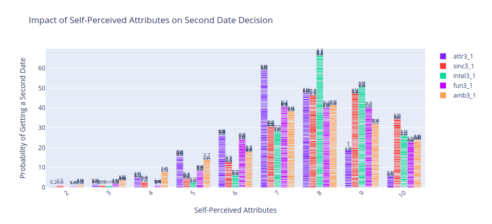
It looks like being confident in your sense of humor and your intelligence can secure you a second date But: confident NOT arrogant !! Being HUmble is your way to your partner heart 🎯.
Factors Influencing Second Date Decision: The Heart’s Ultimate Goal
Let’s get to the nitty-gritty of factors impacting the second date decision – the heart’s ultimate goal. The goal of this code is to leverage data science techniques, specifically logistic regression, to gain insights into the dynamics of speed dating and uncover factors that influence the likelihood of obtaining a second date. By analyzing the participants’ attributes, interests, and self-perceptions, the model predicts the chances of a successful match.
# Import necessary libraries
import pandas as pd
from sklearn.linear_model import LogisticRegression
from sklearn.model_selection import train_test_split
from sklearn.metrics import accuracy_score, classification_report

# Read the speed dating data from the CSV file
data = pd.read_csv('../input/speed-dating-experiment/Speed Dating Data.csv', encoding="ISO-8859-1")

# Select a subset of columns from the data for analysis
selected_columns = [
    'field_cd', 'race', 'goal', 'date', 'go_out', 'career_c',
    'sports', 'tvsports', 'exercise', 'dining', 'museums',
    'art', 'hiking', 'gaming', 'clubbing', 'reading', 'tv', 'theater', 'movies',
    'concerts', 'music', 'shopping', 'yoga', 'exphappy', 'expnum', 'dec_o'
]
data = data[selected_columns]

# Drop rows with missing values
data.dropna(inplace=True)

# Define the independent variables (X) and the dependent variable (y)
X = data.drop('dec_o', axis=1)  # Independent variables
y = data['dec_o']  # Dependent variable (whether a second date was obtained)

# Split the data into training and testing sets (75% training, 25% testing)
X_train, X_test, y_train, y_test = train_test_split(X, y, test_size=0.25, random_state=42)

# Create and fit the logistic regression model
model = LogisticRegression()
model.fit(X_train, y_train)

# Make predictions on the testing set
y_pred = model.predict(X_test)

# Calculate the accuracy of the model
accuracy = accuracy_score(y_test, y_pred)
print(f"Accuracy: {accuracy:.2f}")

# Print the classification report to see precision, recall, F1-score, etc.
print(classification_report(y_test, y_pred))

# Get the feature importances (coefficients) from the model
feature_importances = model.coef_[0]

# Create a dictionary to map the feature names to their importances
feature_importance_dict = {}
for feature, importance in zip(X.columns, feature_importances):
    feature_importance_dict[feature] = importance

# Sort the features based on their importances (descending order)
sorted_feature_importances = dict(sorted(feature_importance_dict.items(), key=lambda item: item[1], reverse=True))

# Print the features and their importances in descending order
for feature, importance in sorted_feature_importances.items():
    print(f"{feature}: {importance}")
Alright, folks, gather ‘round for the hilarious and eye-opening analysis of our dating factors! Drumroll, please!
In the wacky world of dating, it seems like clubbing and movies are the dynamic duo that keeps the spark alive! With impressive importances of 0.22 and 0.20, respectively, these two factors scream, “We’re the life of the party, and we’ll keep you entertained all night long!”
But hey, don’t underestimate the power of museums and yoga, coming in strong with 0.20 and 0.09. Who knew that art and serenity could be such attractive qualities? It’s like saying, “I appreciate culture, and I’m flexible in both mind and body!”
Now, brace yourselves for the plot twist! The one thing that might raise a few eyebrows in the dating world is… drumroll intensifies… your taste in gaming! Hold up, gaming enthusiasts, don’t despair! It seems like some potential partners might find your passion a bit dicey, but remember, there’s someone out there for everyone!
And for all the lovebirds out there, beware of the “reading” and “art” combo, clocking in with importances of -0.12 and -0.14. To our bookworms and art aficionados, fear not! It’s not that your interests aren’t intriguing; it’s just that love might be more of an action-packed adventure for some!
So there you have it, folks! In the unpredictable realm of dating, whether you’re a club-hopper or an art connoisseur, there’s someone out there who’ll appreciate your unique charm and quirks. Remember, compatibility is the name of the game, and the right match will make your heart dance to the perfect melody! Happy dating! 💘
Career Choices: The Path to the Heart
# Mapping of career_c values to their corresponding names
career_c_mapping = {
    1: "Lawyer",
    2: "Academic/Research",
    3: "Psychologist",
    4: "Doctor/Medicine",
    5: "Engineer",
    6: "Creative Arts/Entertainment",
    7: "Banking/Consulting/Finance/Marketing/Business/CEO/Entrepreneur/Admin",
    8: "Real Estate",
    9: "International/Humanitarian Affairs",
    10: "Undecided",
    11: "Social Work",
    12: "Speech Pathology",
    13: "Politics",
    14: "Pro sports/Athletics",
    15: "Other",
    16: "Journalism",
    17: "Architecture"
}

# Calculate the probability of getting a second date for each 'career_c' level
prob_by_career_c = data.groupby('career_c')['dec_o'].mean().reset_index()
prob_by_career_c['career_c'] = prob_by_career_c['career_c'].map(career_c_mapping)

# Create an interactive bar plot using Plotly
fig = px.bar(prob_by_career_c, x='career_c', y='dec_o', text='dec_o', color='dec_o',
             color_continuous_scale='Blues', range_color=[0, 1])

# Update the layout for better readability
fig.update_layout(title='Impact of Career Choice on Second Date Decision',
                  xaxis_title='Career Choice',
                  yaxis_title='Probability of Getting a Second Date',
                  xaxis_tickangle=-45)

# Show the plot
fig.show()
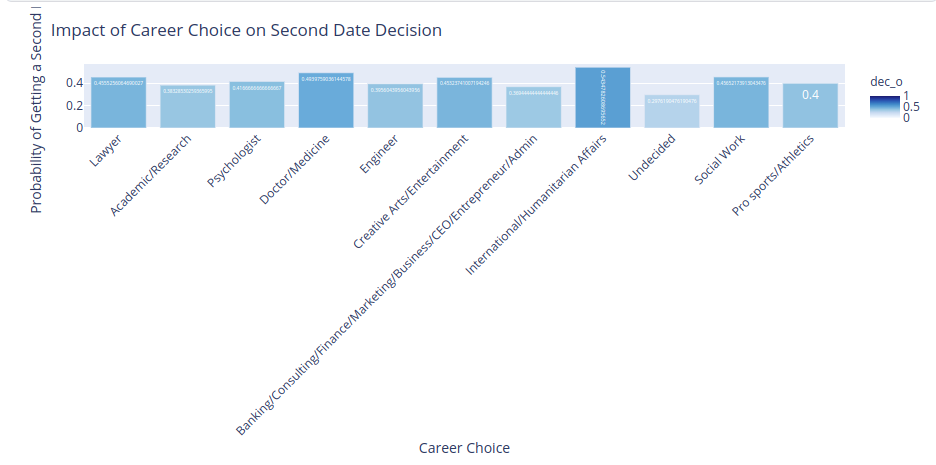
I thought engineering is a sexy job😂!! Well, I know who can say no to a doctor!!!😂🎯
Outgoing souls, rejoice!
- Your adventurous spirit can seal the deal for that second date.
# Mapping of go_out values to their corresponding names
go_out_mapping = {
    1: "Several times a week",
    2: "Twice a week",
    3: "Once a week",
    4: "Twice a month",
    5: "Once a month",
    6: "Several times a year",
    7: "Almost never"
}

# Calculate the probability of getting a second date for each 'go_out' level
prob_by_go_out = data.groupby('go_out')['dec_o'].mean().reset_index()
prob_by_go_out['go_out'] = prob_by_go_out['go_out'].map(go_out_mapping)

# Create an interactive bar plot using Plotly
fig = px.bar(prob_by_go_out, x='go_out', y='dec_o', text='dec_o', color='dec_o',
             color_continuous_scale='Blues', range_color=[0, 1])

# Update the layout for better readability
fig.update_layout(title='Impact of Going Out on Second Date Decision',
                  xaxis_title='Frequency of Going Out',
                  yaxis_title='Probability of Getting a Second Date',
                  xaxis_tickangle=-45)

# Show the plot
fig.show()
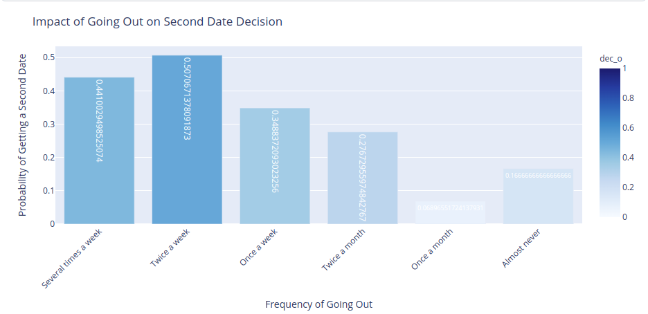
So it seems like being an outgoing person could secure you a second date 🎊🥂
The Power of Data Science in Love
- A logistic regression model whispered the tales of impact.
- The statistics confirmed that clubbing, movies, museums, and yoga held sway over the dating dance floor.
- The journey of self-discovery, career choices, and shared interests can make love’s melody sweeter.
- Moreover, leveraging powerful techniques like k-means clustering can unveil intriguing trends in the early stages of attraction, offering valuable insights into the dynamics of connections formed within the first four minutes. Data science opens new avenues of understanding and enriches the quest for love.
Conclusion
- The journey of finding love is a wild ride, filled with laughter, heartbreak, and unexpected twists.
- Embrace the adventure, for love knows no bounds, and data science adds a dash of magic to the quest for a connection.
As a data scientist, I revel in the joy of decoding the mysteries of love with you. So, folks, may your hearts find their perfect match in this chaotic, hilarious, and enchanting journey called love! ❤️ Happy dating, adventurers! 🚀